Hello everybody,
I didn't use ggplot2 that much until 2 weeks ago. Which in my opinion was a big mistake on my behalf. I think my train of thought shifted from
"I just want to plot something, I don't directly get what's going on with this ggplot2 thing. I'll just find a quick solution"
to
"Wow! Once you get the basic idea, the world becomes your oyster!"
Personally, I blame Matlab. I'm just so used to use a different function for calling each plot (do a specific thing with Input data), that I did not directly realize that a plot is basically (Input data) + (do something with it)
Once you get a hang for it, it get's really fun, because you often just have to change a geom_point() to a geom_smooth() to get a completely different thing - or simply put them both in a row!
Anyhow, without further ado, here is my tutorial-like pdf:
Cheers,
Hannes
Thursday, July 23, 2015
Thursday, July 9, 2015
Links I favorited about data science
I had a few weeks on where I used Twitter mostly on my phone. So I started blindly favoriting tweets that could be usefull. This blog post is mostly for me to curate all these data related links. If it comes in handy for others the better. I try to sort them a bit after topics... hat tips go to all the data scientists that show an immigrant like me some interesting things (too lazy to list them right now...)
General Methods and algorithms
- Data Elixir - what I am doing with this blog post in big
- Machine learning primer - did just skim over it, but it seems this series is great to communicate very important and central concepts with people new to the field
- Statistical learning overload - haven't watched the videos yet, but the Hastie book (freely available) and all the things coming with it are probably a first step for any data scientist immigrant
- Statistical Data Mining Tutorials collection
- Machine learning cheat sheets - a great combination with the Hastie book. Use some of the quick cheat sheet information first and then get down to the more gory details using the book and videos. Check out this sheet for example
- Hyper parameter selection
- A lot of data science cheat sheets (which basically forces you to read more links)
- Machine Learning Visualizations (made in Python and R, horray)
R
- R introduction plus text mining course - @StatsInTheWild is probably my favorite twitter handle
- dplyr tutorial - I still live in a dplyr less world. Which I guess I should regret every time I write df[df[,'Stat1']>0 & df [,'Stat2']>2,] - people might call that dumb, I call it oldschool
- ggrepel: I finally can use the ggplot package for messy textplots
Python
- Speed up Pandas by using categoricals
- pipe data frames through functions (seems neat)
- Sometimes you might need a horizontal boxplot
- Neural Network Implementation (HowTo) - I have no practical experience with neural networks and haven't gone indepth here yet. But I usually like to steal Sebastian Raschka's code ;) - this network activation cheat sheet belongs here as well
- More neural networks
- Data visualization with Python and JavaScript - presentation (side note: presentations are not the nicest form to digest afterwards. But I guess this one tackles a lot of points)
- How to build Python packages
- Scikit-learn-classifiers
Other languages
- The art of command line - really need to get into this one, as my command line skills suck :D
Thursday, March 19, 2015
NBA players are creatures of habit
Hello everybody,
this
is a follow-up to my last post on 'distancology' – the science of
turning all shot charts into one colorful picture. You can find a half-way clean code in my github account. If you run MakeHeatMap.R, you should actually be able to reproduce the result.
One
question that one naturally can ask, when comparing the shot
distribution of players, is how consistent or reliable those shot
distributions are. For example, in my last article I sorted around
200 players into 10 distinguishable groups, using a (vague) cutoff.
But I could as well have used 5 or 20 groups. Now, the question
regarding reliability is: If you compare year to year, how many
players would remain inside the same shot cluster?
Because,
if I would label somebody as a 'corner three guy' due to his shot
distance distribution in one year, but the next year there is a 50%
chance that he's actually a 'typical wing player' guy – that would
be pretty useless.1
Long
story short, what I did is to combine the distance distributions for
two years – and the result is pretty mindblowing2.
The following plot works very similar to the one that I used in my
previous article. I just changed the column on the left, so that it
indicates the effective field goal percentage instead of the shot
attempts. This way it is easier for people to be in awe about Stephen
Curry. It shows both seasons for every player that had at least 600
attempts (data is from the 3rd of March) during this and the last season – and here it is3:
Monday, March 2, 2015
Before this probable nonsense about 'fouling while leading' gets spread
Hi everyone,
I thought about letting it slip, but then I read this quite from an SI.com article:
But more or less, that's what the paper said. Their reasoning was the following:
The point is this:
I thought about letting it slip, but then I read this quite from an SI.com article:
"28. The most staggering NBA stat from Sloan? Fouling when winning can increase your chances by 11 percent, according to a paper written by Franklin Kenter of Rice University. The paper shows that fouling near the end of games pretty much makes sense in every situation, whether you’re trailing or leading. When behind, it advises fouling one minute out for every six points you are behind. When leading, it suggests fouling one minute out for every three points you lead."Side note here: 'The paper shows that fouling...' is a typical case of 'reporter overstates what scientist says'. I guess 'The paper says that their model indicates...' would be more realistic.
But more or less, that's what the paper said. Their reasoning was the following:
"The concept of fouling when ahead may be counterintuitive. However, toward the end of the game, the main goal of the trailing team is to increase the total variance in order to widen the window of possibilities that win the game. One main component in this wider variance is the riskier 3-point shot. The trailing team can limit this variance by fouling. the leading team may give up points, on average, but limit the trailing team to 2 points per possession. This decreases the total variance and, with a sufficient lead, increases the leading team’s chances of winning."Now, I could go on a very lengthy statistical rant about this. I tried to figure out where they made the mistake in their model, but the paper was too vague in terms of their methods.
The point is this:
Friday, February 27, 2015
Let them handle their business – a case against over-helping
This summary is not available. Please
click here to view the post.
Thursday, February 19, 2015
Data dump:Isolation is a meritocracy, miscellaneous is something you should avoid
Hi everybody,
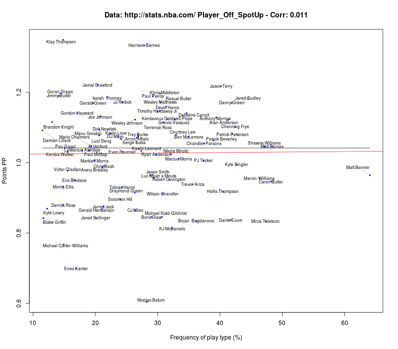
this is mostly a data dump after I looked at the new nba.com Synergy Sports data (next stop tracking data!). Feel free to use the plots.
For players I always show those that have enough attempts
One personal note: The Synergy data can be easily wrongly interpreted. For example, a cut is mostly not a play itself. If you look at the players that attempt a lot of cuts, you find mainly center that most probably are beneficiaries from other stuff that is going on (cue to Blake Griffin throwing a lob to DeAndre Jordan).
Even though cuts have a high value for Points per possession, cutting all the time is not the solution. (This is a very personal note, as my last rec league team had a disastrous knack of cutting into whatever real playtype was going on at that moment...)
Cheers,
Hannes
Friday, January 30, 2015
Revisiting Stats stabilization
Revisiting Stats stabilization
a warning before you start reading this. You can find a more polished version at Nylon Calculus (memo to myself: add link here as soon as you got it). They also published another piece of mine and have a lot of other great stuff. But if I would draw a Venn Diagram of people that read my blog and people that read Nylon Calculus, I am pretty sure that you know all this already...
This version has a bit more (probably boring) details on why I find previously used methods impractical. It also has a bit more shiny plots, which in the end where not helpful for understanding. So, if you are here for the shiny plots scroll down to the end. There is also an R script so that you can produce shiny plots yourself. You can find a github for the R function that I wrote here.
Side note: One reason for this blog entry is that I'm starting to move from Matlab to R. If you find technical flaws in it let me know. :)
Hello everybody,
over the last years there seems to be one main way to estimate the stabilization of a stat, ( http://nyloncalculus.com/2014/08/29/long-take-three-point-shooting-stabilize/ , http://www.fangraphs.com/blogs/stabilizing-statistics-interpreting-early-season-results/ , http://www.baseballprospectus.com/article.php?articleid=17659 ) based on the work of Prof. Dr. Pizza Cutter. While the work itself is technically sound, it has in my opinion several drawbacks. In short, the method is in my opinion unnecessarily complicated, can be easily misleading and is as a result impractical to use. In the following, I will explain these three points of critique, while introducing a simpler and more practical method that works perfectly well for a certain kind of commonly measured data.
Thursday, January 8, 2015
Scatter Plot Data
Hi everyone,
I decided to release the code that I am using for my scatter plots. Mostly because I am not using it often enough to keep it for myself, so I hope that it is useful for somebody else. Use it at your own risk. Feel free to remove my name or change anything. And so on (we all know these proclamations...).
In my opinion, the output is pretty cool, especially if you combine it with Inkscape or Illustrator (which works well if you save the plots as pdf)
As an example, take the plot I have here: http://sportstribution.blogspot.de/2014/03/three-quick-points-on-kyle-korver-and.html
You just have to use the same axes settings and different filter or data points and you get two plots that you can easily merge (and color differently).
Especially for those of you that have the data readily at hand (I'm looking at you, Nylon guys!) it could be worth to give it a try.
This code was my first try in learning Python and it is therefore far from perfect. It is only 400 lines and not so many packages, so it might also be interesting for those of you that are as well interested in learning Python.
The code should work with Python2.7 and the right packages. If someone knows how to update this, I am glad to listen.
Oh, I almost forgot to add the github: https://github.com/SportsTribution/SportsTribution-Scatter.git
Cheers,
Hannes
Subscribe to:
Posts (Atom)