Hello everybody,
this
is a follow-up to my last post on 'distancology' – the science of
turning all shot charts into one colorful picture. You can find a half-way clean code in my github account. If you run MakeHeatMap.R, you should actually be able to reproduce the result.
One
question that one naturally can ask, when comparing the shot
distribution of players, is how consistent or reliable those shot
distributions are. For example, in my last article I sorted around
200 players into 10 distinguishable groups, using a (vague) cutoff.
But I could as well have used 5 or 20 groups. Now, the question
regarding reliability is: If you compare year to year, how many
players would remain inside the same shot cluster?
Because,
if I would label somebody as a 'corner three guy' due to his shot
distance distribution in one year, but the next year there is a 50%
chance that he's actually a 'typical wing player' guy – that would
be pretty useless.1
Long
story short, what I did is to combine the distance distributions for
two years – and the result is pretty mindblowing2.
The following plot works very similar to the one that I used in my
previous article. I just changed the column on the left, so that it
indicates the effective field goal percentage instead of the shot
attempts. This way it is easier for people to be in awe about Stephen
Curry. It shows both seasons for every player that had at least 600
attempts (data is from the 3rd of March) during this and the last season – and here it is3:
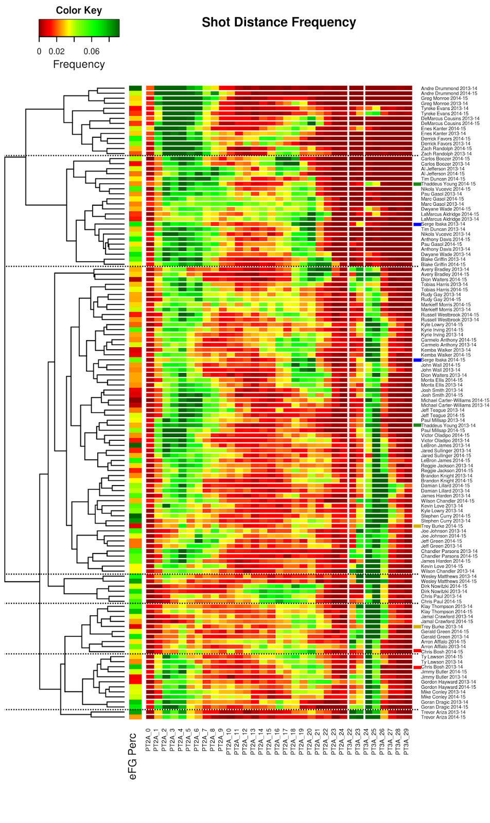
I
hope you find it as amazing as I did when I saw it the first time.
Shooting distance distribution is a complicated construct that
combines team strategy with the personal role of a player inside the
team and things like fast break percentage or shooting habits. So, you
would expect that most shot distributions vary at least a little bit.
But no, 47 of 63 players are their own closest neighbors between this
and last year. I have no statistical method to compare it with
correlation values, but I would say that it has a p-value of bonkers. As an
example, look at the top, how DeMarcus Cousins, Enes Kanter and
Derrick Favors all have similar shot distributions between mid-range
and close-up, but Cousins takes his mid-range shots from 20 feet out,
Kanters from 17 and Favors from 14. Or that Jeff Teague and Michael
Carter Williams have their close range shots a little bit further
away from the basket than most players (floater?), but Jeff Teague
shoots a bit more three pointers. Or that Steph Curry and Damian
Lillard are the only two MFers that regularly shoot from 27 feet out.
I don't know if Damian Lillard is lazy or something, but more than
130 times this year (3rd March) he decided 'I don't want to walk this additional
meter'. And 43 times he got away with it.
Having
shown that most players are reliably clusterable (is that a word?), I
will now present the four players (6%) that changed their cluster4:
- Serge Ibaka: Exchanged a bit of his midrange and a lot of his close-up game for a three point shot. I do not feel in the position to comment on this.
- Thaddeus Young: Replaced half of his three point attempts this season with long twos. It seems like somebody flip'd his game. (Ba dum Tss!)
- Chris Bosh: Even so the two leaves are very close to each other, they are on two different branches. This years Chris Bosh was not found close to the basket that often. I also hope that he gets well soon, I miss his photo-bombing
- Trey Burke: Is a good example why clustering is not a precise science. If you compare his two distributions they both look very similar. Something in the clustering process made 2013-14 Trey Burke fall into the 'We don't go to the basket that often' group, while 2014-15 Trey Burke became 'Stephen Curry without actually making the shots'.
That's
it for today. Just wanted to repeat one technical thing: clustering
always consists of two parts. First you find a distance metric and
then you find a rule how you cluster things together. I hope I could
convince you that the distance metric part is pretty awesome. I'll
try to work on the linkage part if possible.
Cheers,
Hannes
1
It's like saying somebody is a good defender because people shoot a
low 3 point percentage against that person without
realizing that this is mostly random – wait,
I digress...
2
Note to myself: Turn this sentence into a clickbait for Twitter ;)
3 It
is so much easier to publish heatmaps if you don't have to make them
fit on a DinA4 page.
4 I kept it at 7 clusters, as I have no idea where to cut the big 'we shot three and close range and sometimes in the middle' cluster. Even though the distance metric is precise, the subsequential clustering is not
Amazing Post. thanks.
ReplyDeleteJual Kacamata Sport